
Have you ever selected a paint color and when you finally tried it out on your wall, you begin to hate it? You thought you already selected the best color paint in the house but you were mistaken. More so, you said to yourself, “It’s just a color, and it can be painted over again!” The frustration is real and painful, imagine after exerting effort, time and money, you’ll only end up wasting it because you chose the wrong color? Because choosing the perfect color combination can really seem like a daunting task when there are just so many paint color options out there. But by learning from this common mistake that almost everyone makes, you’ll get there eventually in choosing the best color paint in the house.
As we all know, painting your house can come across as an essential and daunting task to many in designing or building a house. Whether you are painting your house for the first time or renovating it and repainting to match the color trends or lucky colors this year 2022, it is really important to select the right and best color paint for your house. Below were some helpful tips on how to pick the best paint color based on the mood, lighting, fabric patterns, and more! Additionally, aside from giving you tips, there is also some unsolicited advice that you should never do when picking out your paint.
The most basic advice that you can get in choosing the right color is of course to start with the colors you love. You have a starting idea with the colors that you love, that is free from any pressure or that is not bound by any traditional color schemes for a specific decorating style. Using your favorite color as your base color, you can use it as an inspiration to create a color scheme around it, thereby solving your biggest question, “what is the best paint color inside the house” or the right color that will best suit your home.
1. Think First About the Function of the Room
As already mentioned above, you should start first with the colors you love, BUT take note, you should only consider it for inspiration. Because your first concern must be figuring out the function of the room as well as the color of your furniture. It may seem natural at first to pick a color immediately but I’m telling you, it is much easier to choose a paint color that goes well with the pieces and purpose of the room.
Visualize first in mind your expectations for the room. Think hard about what do you want to see for the finished output. Or for starters, you can go to Pinterest! That website offers millions of inspirations if you can’t decide. You can make a board for each room that you’re planning to paint and start pinning rooms that catch your attention.
Have you figured out the function of the room? Do you want to make your dining room appear more spacious? Then choose more neutral shades like white or beige for your walls so lights will reflect better. Or if your goal for your living room is to be a spot for social gatherings or more like an Instagram-worthy background? Then paint your walls with bold colors like apple red or a vibrant orange to add exciting and impressive energy. But if you just want some calming space where you can unwind after a long day from work, then cool shades of blues and greens can help you achieve that or even neutral shades for minimalistic feels!
After you decided on the function of a room in your house, you could also use some existing pieces in your house as inspiration for your wall color ideas instead of choosing paint colors first and then buying furniture and decor to coordinate. It can help your room to seem more cohesive and for the most part, it can save you a lot from any frustration later on of not being able to find the best decor that goes well with your chosen wall color.
For a more straightforward guide, follow these steps for creating your perfect color scheme:
- Start by selecting three specific colors from an existing piece from your house. It can be the color of your sofa, your favorite scarf or a painting, or in short, anything that gives you comfort or has a deeply emotional connection for you and then take that one object to the paint store. Look for sample strips with those colors that you have brought and you instantly have numerous colors that you can use.
- The next step is to choose one of the three paint colors as your wall color and to save for later the other two for another purpose around the room.
- Lastly, choose a fourth color that can be used as an accent. Pop a little of that color everywhere in every room of your house, for instance through your pillow or kitchenware. It just makes a great connection for spaces.
2. Take into Consideration the Amount of Natural Light
Natural lighting, or what is well-known as daylighting, is a quite impressive technique that efficiently brings natural light into your house using exterior glazing, like your windows. Maximizing the natural light in your house has a great impact not only on the physical appearance of the space or room but as well as your overall mood. It has been proven to increase health and comfort levels for homeowners. Moreover, the amount of light that a room can get, could also greatly affect the paint color that you will choose. On top of that, it reduces your need for artificial lighting requirements and thus saving and conserving more energy. Good job in saving the environment, yay!
Did you know that the good lighting of a room can actually affect your mood? Actually, lighting is one of the most important things to consider in designing your house, yet it is still one of the most forgotten aspects of designing a house. But in fact, it helps you to improve the physical appearance of the room as well as it affects ones’ mood. If you make your room dim and close all the curtains, instantaneously it will make you feel sleepy. You can check this article from Bria Homes for more tips on how to maximize good lighting, How Does Lighting Affect Our Mood?
Having stated above the benefits of having natural light at home, one great tip is to sample the color that you want in a small spot on your wall and then look at it during different times of the day in order to make sure that you like it. You have to do this because the paint color that you will choose, might look different due to the varying light temperatures that bring out its undertones and also something that you may miss upon looking at paint samples at the store. You can be unpleasantly surprised by the undertones of the paint colors. Undertones are the sneaky colors hiding beneath your chosen paint color. For instance, the purple color that you used in your kitchen might look cool and amazing when the sun is shining but it could look grayish at night, which you might not prefer. Hence, sampling is very essential, it is the only way to accurately see how an undertone will appear in your house. So again, to be more careful, just try to paint a sample on a spot of your wall first to achieve the best color paint in the house. You could actually ask a hardware or paint store if you can have some samples of the colors you want and try them on a wall. This can really help you a lot in visualizing the suitable color in your house with your existing decor, it can help you to avoid as well any second-guessing in your chosen paint color later.
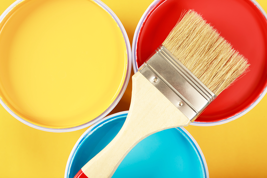
3. Follow the 60-30-10 Rule
Sometimes it’s easier to just stick with existing rules so you won’t commit a mistake. It’s hassle-free and very convenient, you won’t ever feel frustrated with these very simple rules. The 60-30-10 rule is a classic decor rule, a very simple and easy way to come up with a balanced color palette for your home. The decor rule provides that 60% of the room should be the primary or main color, 30% should be the supporting color or texture and the last 10% should be for an accent. Simply stated, 60% is the overall color that covers the whole room, it is the background color. When you look at the place you’ll say, it’s the “red” room, or whatever color you choose. The next percentage is your 30%, which will become your secondary color in your place and will provide support for the main color, but distinct enough as to not clash with the main color and to give the room a more interesting look. Visualize it in a way that you’ll be using half as much of this color as you did for your primary color. Lastly, the most tricky part is the 10%, your accent color. It can be as vibrant as apple red or bolder or you can just settle for a more subtle color, mainly all depending on what look or vibe you want. It’s the last 10% where you can be more playful because it is what gives the room character. For instance, the 60% is for your walls, sofa, any large foundation pieces, or even large rugs. While the 30% could be your curtains, side chairs, or the smaller foundation pieces. Finally, the 10%, comprising your throw pillows, artwork, or some accessories.
4. Consider the Color Psychology for Your Home
It was already mentioned above that the color of your house or a room could greatly affect your mood and can influence how you feel in a place so so think hard about what feelings you want to evoke in a particular room in your house. Basically choosing color is really a big consideration in designing your house. If you’re not yet sure how to pick the paint color for your house, refer to color psychology as the best resource that can help you revamp your home easily. So what is color psychology? It precisely involves the wavelengths from light that bounces off your retina, changes into electrical impulses, and traverse to your brain’s hypothalamus. It’s not really the same as with just any simple color context which is more based on our liking.
The way we perceive color is very personal and emotionally motivated. It can make us feel energized or calm, relaxed, sleepy, or provoked. The most important part of choosing any color scheme is finding the perfect colors and shades that are right for your needs and wants. Bear in mind that cozy and earth-tone shades are the most suitable and beautiful neutrals of a more intense main color. This article may also give some enlightenment on what you should not do in designing your bedroom, for instance, a common mistake of painting it with red which will not help you fall asleep at all– The Two Most Common Bedroom Styling Mistakes to Avoid.
So here’s a quick guide of which moods the different colors represent:
1. White
It symbolizes cleanliness, quietness, and youthfulness. The shade of white could make a room have a refreshing and cool feeling, perfect if you want that room to be cozier. Plus if you want to achieve a more formal feeling, you can never go wrong with white!
2. Black
It reflects power, mysterious personality, but above all pure elegance. It’s a classy color. But bear in mind that too much black can look depressing so know to incorporate it with other colors other than shades of black.
3. Red
It brings the feeling of confidence and creates excitement, energy, and a lot of passion. It is one of the most psychologically stimulating of colors. Just keep in mind that do not use red in your bedroom as the main color, you cannot feel at ease with this color.
4. Purple
It stimulates the imagination. It creates a space with a blend of calming yet uplifting tones. It can make you feel inspired and creative but in a more focused way without any rise in your heart rate.
5. Yellow
It brings joy and optimism. Plus a pale yellow can bring a sunny feel to a space without being overwhelming. Yellow can help to mental stimulation, to inspire creativity and communication.
Now that you know how to choose the best paint color for your home, it’s time to get some brushes and start painting! Again when choosing the best color paint in the house, consider of course the ingredients, there should be no harmful chemicals in it that can be dangerous when you breathe it, as well as the room’s function, and the colors that should evoke or spark the right mood. Once finished painting the color in your house, you should be able to enjoy your new space.
Written by Katherine Kaye Villafuerte