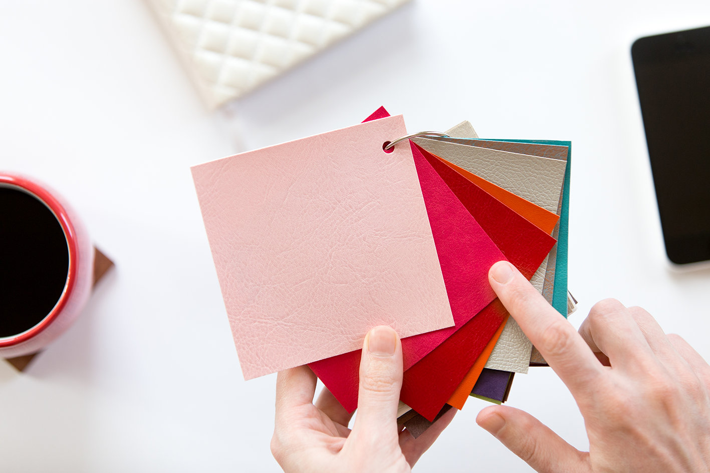
The variety of colors that can be utilized in a design and the frameworks that are employed to arrange these colors into specific combinations are referred to as the color scheme. A color palette is a collection of hues that are used specifically together in a design or in a product display. In visual merchandising, color palettes and color schemes are used to draw attention, create unified aesthetics, pique the senses, and produce an aesthetic that is aesthetically pleasing as a whole. Colors have a history of evoking associations or feelings. Marketing and branding can benefit greatly from this. For customers, various color can convey various messages.
With so much at stake, selecting the correct color combination might be challenging if you have little creative knowledge or time. We have now covered the fundamentals of color selection in a way that is accessible to beginners. You may find color ideas for everything from branding to interior design to beauty to fashion.
Red, blue, and yellow, the three fundamental colors, are combined in various ratios to create all other colors. Check out the color wheel below to see it in action if you’re having trouble believing it at first. You can make a secondary color by combining two basic colors. A tertiary color is produced by combining a secondary color with a primary color.
Keep this color wheel in your pocket as a reference to see how different tones are created.
Color Palettes to try for the Bold and Daring
Bold Colors or simply as bright colors. Due to their hue and saturation, bright colors are typically visually arresting and noticeable. They are strong and intense in nature. Warmer hues like red, orange, and yellow are thought to be brighter than cooler hues like blue and green, though any hue can be bold and bright when used correctly. The following are the sets of bold and daring color palette:
- Despite the fact that winter is rapidly approaching, you don’t have to change your color scheme. There are many hues that are appropriate for the season but still have impact. Cherry red or a soft maroon make beautiful accent colors. These rich, warm hues stand for romance, elegance, and desire. Use rich greens and blue-greys with your stunning rouge accents. The bold reds will stand out even more thanks to these earthy tones. Red does precisely what you want it to do—walk the line between elegance and fearlessness!
#8C170D, #F2836B, #D9753B, #36A6BF, #0A4273
- We all agree that red is essential for a striking color palette, and there are many ways to incorporate this opulent shade into your home. Instantly modernizing a space without appearing overpowering is red and black. For a look that is both vibrant and elegant, combine red-orange tones with grey and ivory. Keep your furniture modern and understated, and choose a striking carpeting. A piece of abstract wall art should be chosen to finish the modern style.
#A63251, #40131F, #516373, #D94848#181C1E
- Choose a charcoal grey if you feel like black would be too harsh for your room. Dark grey retains a striking visual impact without the inherent edge of black. Incorporate warm hues like burnt orange and golden yellow to prevent your home from seeming overly chilly. The best thing about warm hues is that there are endless possibilities for color combinations. Choose from rusty crimson to tart tangerine for your wall art and home furnishings. You can add as much color as you like to your interior, provided that your floor and walls remain bright and white.
#BFAEAF #8C0404 #A63C3C #F2F2F2 #0D0D0D
- Want to give your house a bit more glitz? There is no better moment than the present. It’s completely acceptable to retain some spaces in harmony while keeping others in contrast. To find what seems right in your particular area, experiment with dramatic hues in several spaces. Making a bold color choice ultimately comes down to being fearless and selecting hues that make you happy.
#F29E38, #BF6430, #A62D12, #8C2920, #141311
- Although dramatic colors are frequently employed in modern interiors, drama has always been a part of design history. Use a deep, imposing color, such as dark teal or navy blue, to paint an accent wall, drawing influence from art deco homes. Set off this bold decision with furniture in classic coral or poppy pink. To combine the two clashing tones, use plum.
#CB2D24 #5E6C75 #3F443D #122424 #6D1221
- Explore a variety of pink and purple hues with this striking color combination. An elegant transition from the rich, gloomy dark blue to the lighter eggplant is provided. These four hues might create a stunning gradient when combined with two shades of deep fuchsia! Although purples are vivid by nature, they can also be employed in less energizing environments. Imagine a beautiful cloth with many tones or a serene design with a galaxy theme.
#F2389E, #BF3B84, #542B8C, #7155D9, #2C2F73
- These colors aren’t typically thought of as complementary hues. But these four color combinations are actually rather distinctive and striking when utilized in the proper proportions! The 2022 color of the year, Very Peri periwinkle, adds a touch of fashionable modernism while the honey yellow and lavender purple give off a more rustic vibe. It’s surprising how firmly grounded the black color is. We advise utilizing black in designs only for subtle accents or as text, letting the other colors speak for themselves. If applied carelessly, black can be overwhelming.
#BF4E24, #D98032, #F2B749, #565AA6, #A458A6
- This similar blue color scheme makes us think of the ocean! Use these vibrant hues to add life to any of your projects while maintaining a cool tone. Take note of how the yellow stands out when combined with the deeper blue tones. The contrast is fantastic!
#F2AA8, 0#ECF2BB, #79F2BA, #59D9CC, #5ED7F2
- Here is a vibrant and original five-color palette! To produce a true flash of color, layer the bright green and neon pink with more muted hues like rose and soft grey. Neon colors are popular in maximalism, and using this color scheme is a terrific method to excite onlookers.
#BDF24B, #91F24B, #F238D3, #D952B5, #F2CEDB
- The combination of these five hues creates an extremely beautiful pallet. We adore the soft kawaii colors used in combinations that are both bright and happy and soft and calming. These lovely hues would go great together practically anyplace, but we see them working particularly nicely in social media posts and clothes for glittery parties.
#98D96A, #77F2B9, #049DBF, #CDA3D9#, #BF3480
Choosing the ideal color combinations can be overwhelming, but keep this guide close at hand to stay motivated and aware of current color trends that you can use to your color design of your affordable house and lot or condominium from BRIA Homes. For many people, selecting a color palette is both the most crucial and most difficult step in the decorating process of your home. And understanding color theory also plays a vital role in combining colors when it comes to interior design. The appropriate colors must be chosen because they can affect moods, add to the ambiance, and change how someone feels. Colors have a significant influence on human psychology and emotions.
BRIA Homes, one of the Philippines’ leading housing developers, aims to bring affordable house and lot packages and condominium units closer to ordinary Filipino families. BRIA Homes takes pride in its quick construction time. It uses new home building technologies in every project to reduce construction time without sacrificing quality.


